
UX Design - case study
Diploma project - research and design an improved flight booking experience for a fictional airline. The project included:
Research - creating and evaluating online survey, competitive benchmarking and running usability testing on existing apps.
Evaluate - analysis the collected data with an affinity diagram and customer journey map.
Design - creating the customer flow diagram, defining the navigation and interaction, prototyping and production of wireframes.

USER RESEARCH
The project aimed to develop an improved flight booking system. I focused my research on finding out what competitors were doing, where their pain points existed, how they might be addressed and how the experience could be improved. Existing research showed that many users use desktop over mobile to book flights, and I was keen to learn why this was.
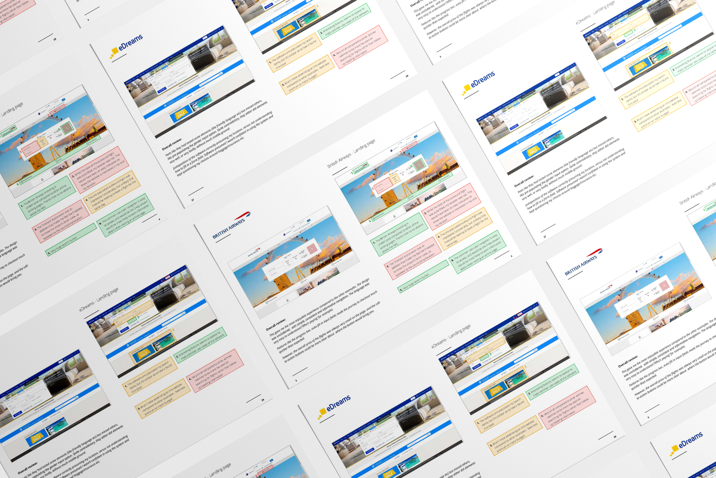
Competitive benchmarking
By evaluating the current booking process of existing airlines, I was able to see first-hand the grievances a user might face when booking a flight. By comparing 4 websites, I was able to form an initial view of where issues may likely appear during the interview stage; mostly around the seat selection page and the ‘additional extras’ or add-ons the companies were trying to upsell customers.

Online survey
Results showed that those surveyed only used airline booking systems every few months, with two main goals; to book a flight and to check prices. Several users felt that completing a full booking transaction was slow, with answers like “too many clicks” being a common thread. Individual responses were recorded and grouped to find recurring positive and negative outcomes.
User testing and interviews
I held three interviews with people who had taken a flight in the past twelve months. I wrote a basic script and set of tasks for them to follow to ensure the interviews were as fair as possible.
EVALUATION AND OBSERVATIONS
To analyses the findings of the research, I used an affinity map to highlight and group similarities of responses, and created a customer journey map to visualise the flow a user would take. These results would form the basis of the problem I would later try to solve through design.
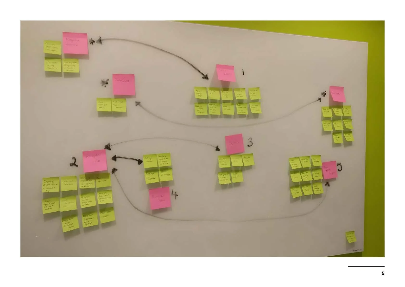
Affinity Diagram
I was keen to ensure the data collected for the affinity map didn’t just focus on negative experiences. Learning from a user’s positive experience would help include common design conventions or patterns further down the line.

Customer journey map
Creating a customer journey map was really helpful for developing the user flow in the next stage, as it highlighted key stages where a user’s experience was low and could be improved
From all the research I had gathered, I had three key areas I wanted to address; a clear progress indicator; the ability to consistently see prices onscreen; and simplified seat selection.
DESIGN

Desktop flow diagram
With the research and analysis phases complete, it was now time for me to get into design mode. Before designing the website, I first planned the flow, considering each step the user would take and design each screen and screen state with those steps in mind. I focused on one primary use case - from homepage, to searching for a flight, to booking.

Defining navigation
Using the flow diagram as a structure foundation , I roughly drafted the navigation for a desktop user case, from homepage to booking. I did this exercise twice, the second time allowing me to refine my thought process and rationale for choosing a global navigation bar style.

Defining interactions
Using the flow diagram and previous sketches, I mapped out all screens and screen states for the user. Many iterations were made to address the pain areas that arose in earlier research, such as defining the initial landing page to ensure information was a s clear as possible, and refining the seating booking process.
PROTOTYPING

I created both a low fidelity, and medium fidelity prototype. The low fidelity uses previous screen sketches, and was created using Marvel. It served as a base for the medium fidelity prototype, to help figure out how interactivity might work when I began designing in Adobe XD.

WIREFRAMING
Using the screens and screen-states from the previous projects, created a wireframe with all the necessary detail a developer would need to build the application accurately.

Accreditation
The Professional Diploma in UX Design is awarded by the UX Design Institute, Dublin, and accredited by Glasgow Caledonian University. I received a grade of 84% in my final exam.